Sam’s Juice – Vitamin Coconut Water Range
Services:
Packaging Design · Range Development · Custom Illustration · Product Visualisation · Marketing Collateral
Date:
2026
Industry:
Beverage & FMCG
Building a Cohesive Packaging System Across a New Beverage Range
Sam’s Juice approached me to develop the packaging for a new 500 mL vitamin coconut water range combining refreshment with added vitamins and prebiotics.
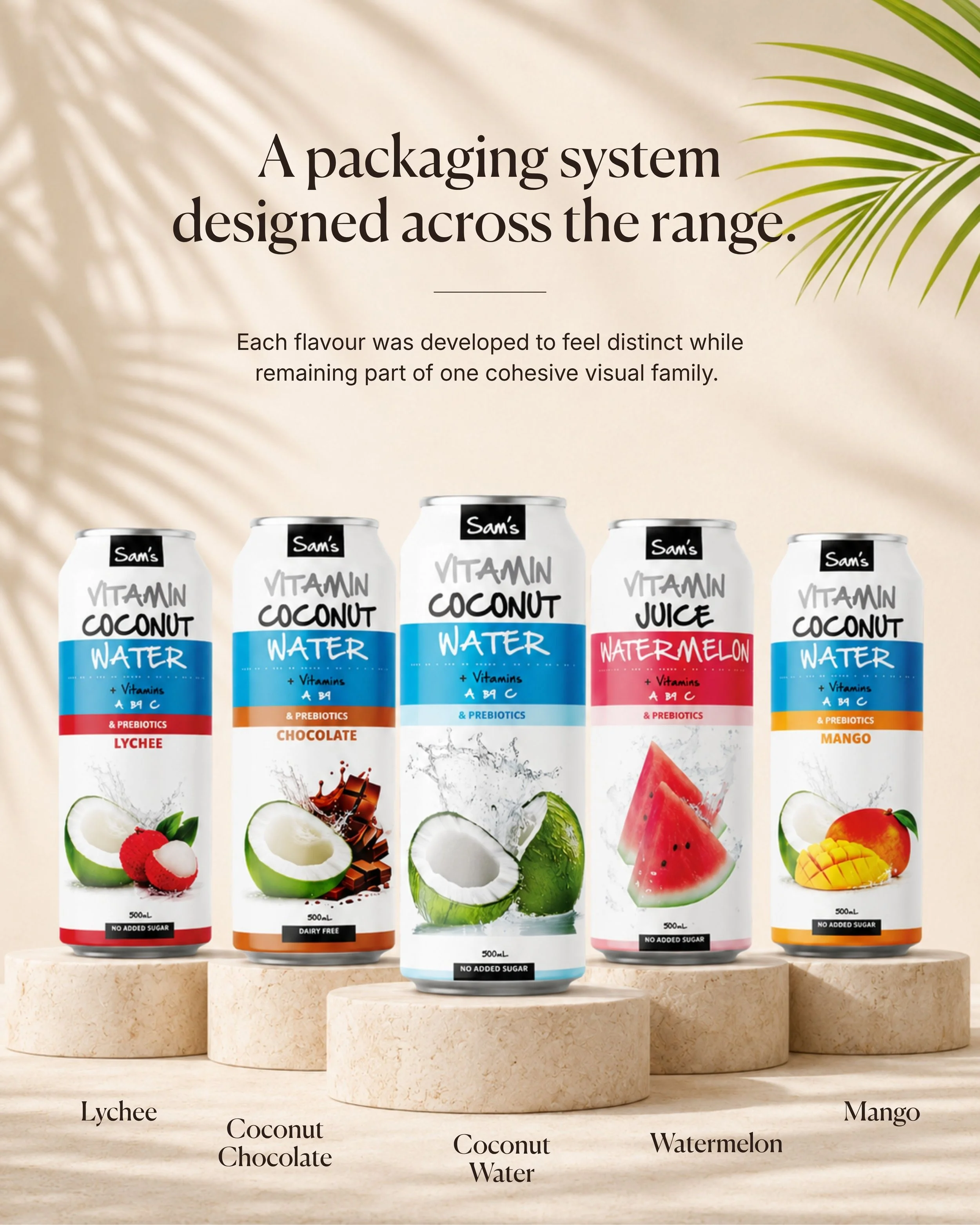
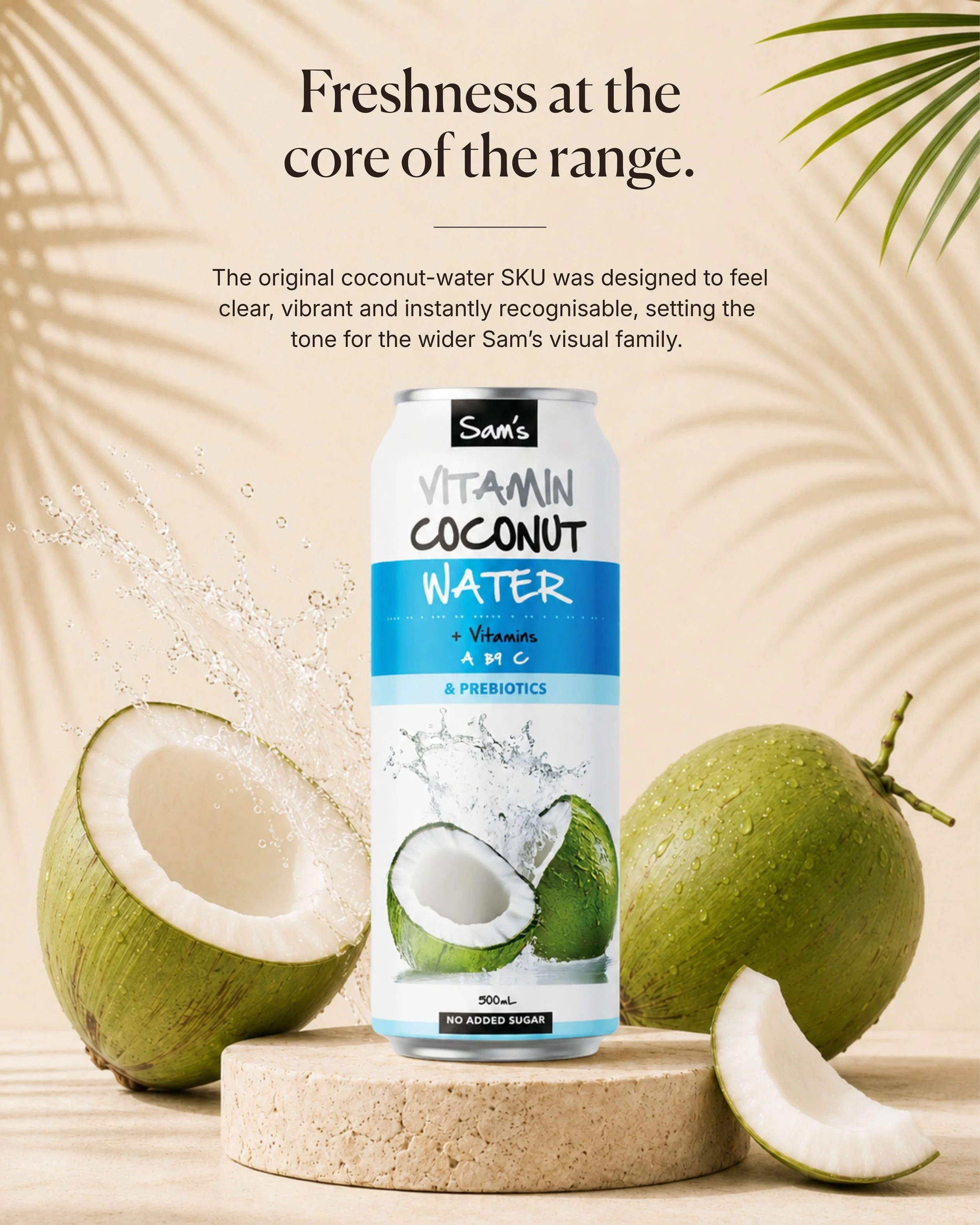
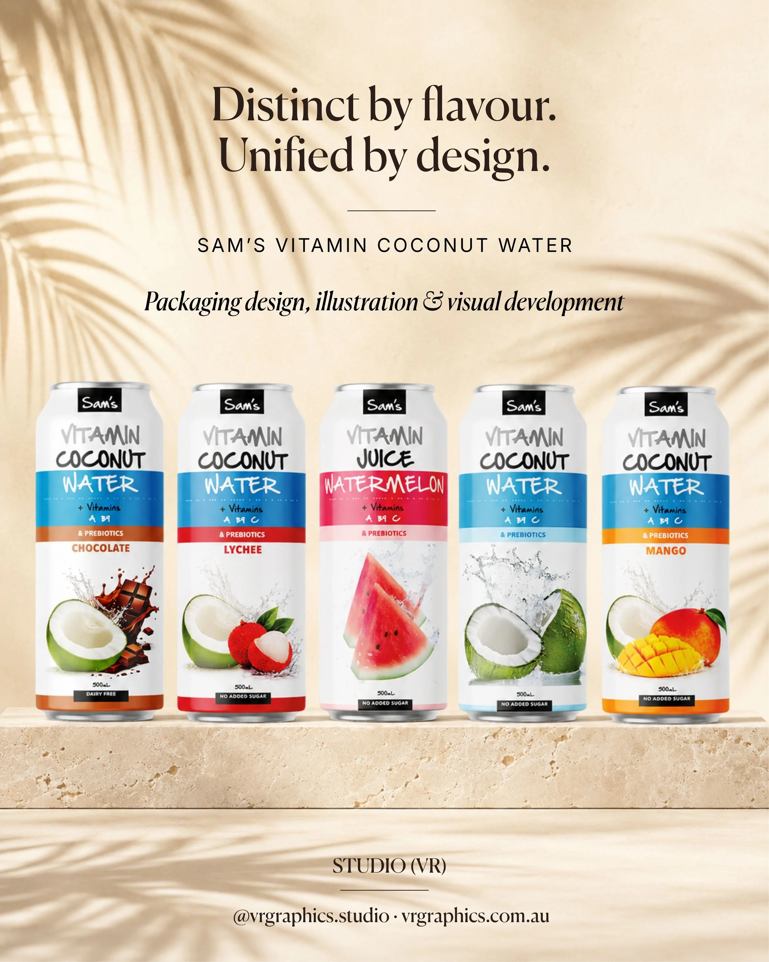
Beginning with the original Vitamin Coconut Water, the visual system was extended across five distinct products: Coconut Water, Coconut Chocolate, Lychee, Mango and Watermelon. Each flavour needed its own personality and strong shelf recognition while remaining clearly connected to the wider Sam’s brand family.
The Challenge
Create a packaging system that communicated freshness, flavour and functional benefits within a limited can format. The range needed to feel vibrant and approachable, allow customers to distinguish between variants quickly and maintain clear consistency across every SKU.
My Role
Creative direction, packaging design and range development from the original coconut water concept through to flavour extensions, supporting illustrations and presentation imagery.
What I Delivered
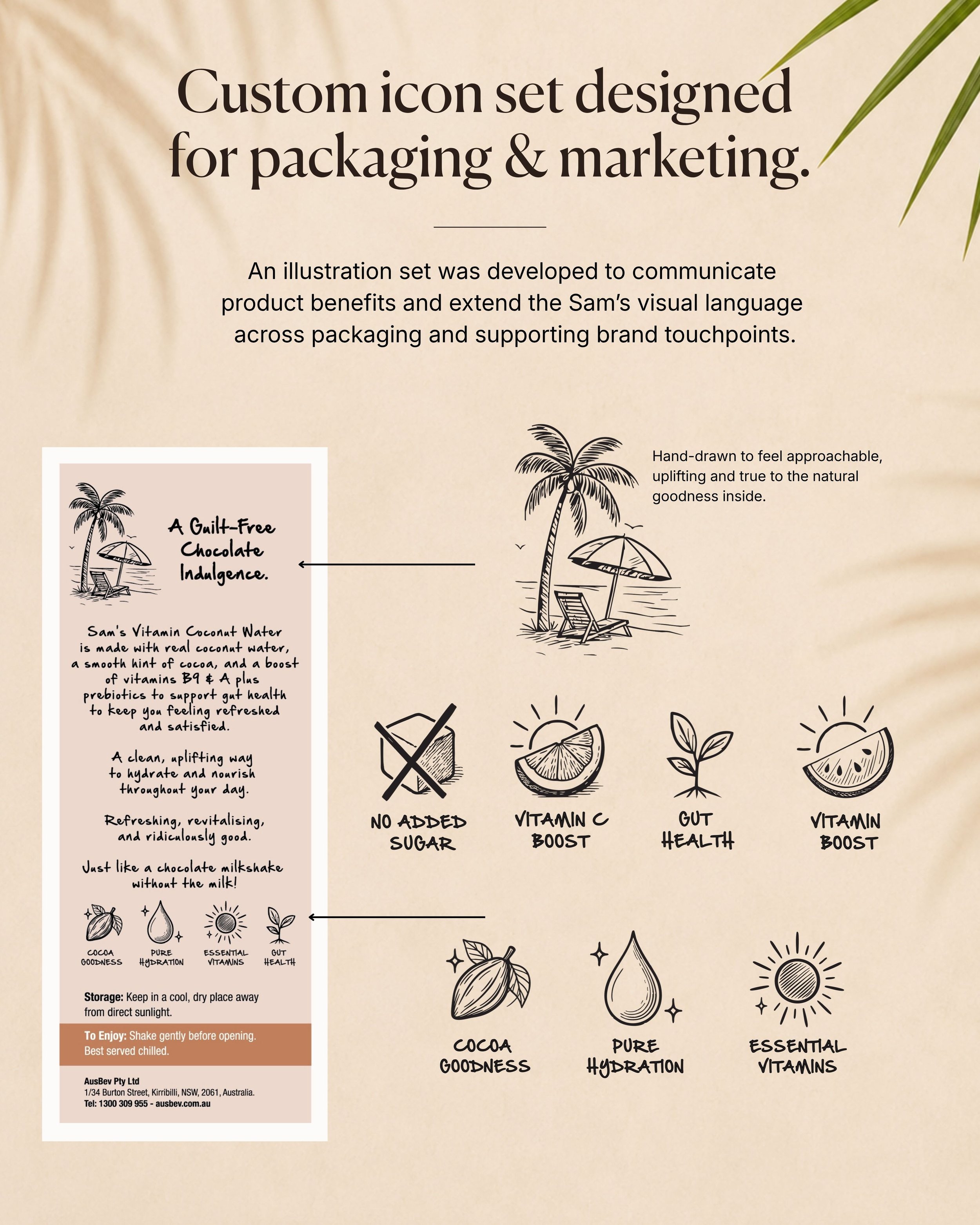
Packaging design for five 500mL beverage variants, range architecture, flavour colour coding, product imagery, custom benefit icons, supporting illustrations, back-of-pack visual elements, artwork adaptation and promotional product mock-ups.
Collaboration
I worked closely with the client to translate the product range, flavour profiles and key benefits into a clear and engaging packaging system. Each new variant required careful consideration of colour, imagery and product hierarchy to ensure it felt distinctive while remaining part of one cohesive family.
The Outcome
A vibrant and flexible packaging system that gives every flavour
a recognisable identity while maintaining strong visual consistency across the complete range.
The original coconut water established the range’s fresh blue visual foundation, while individual accent colours and ingredient imagery distinguish the Chocolate, Lychee, Mango and Watermelon variants. Custom hand-drawn icons extend the visual language across the packaging and supporting marketing materials, communicating product benefits in an approachable and memorable way.
Skills & Capabilities
Creative direction · FMCG packaging · Range architecture · Packaging hierarchy · Flavour differentiation · Custom illustration · Icon development · Image composition · Product visualisation · Artwork adaptation · Client communication · Project coordination