Port Fairy Candle Co – Victoria
Services:
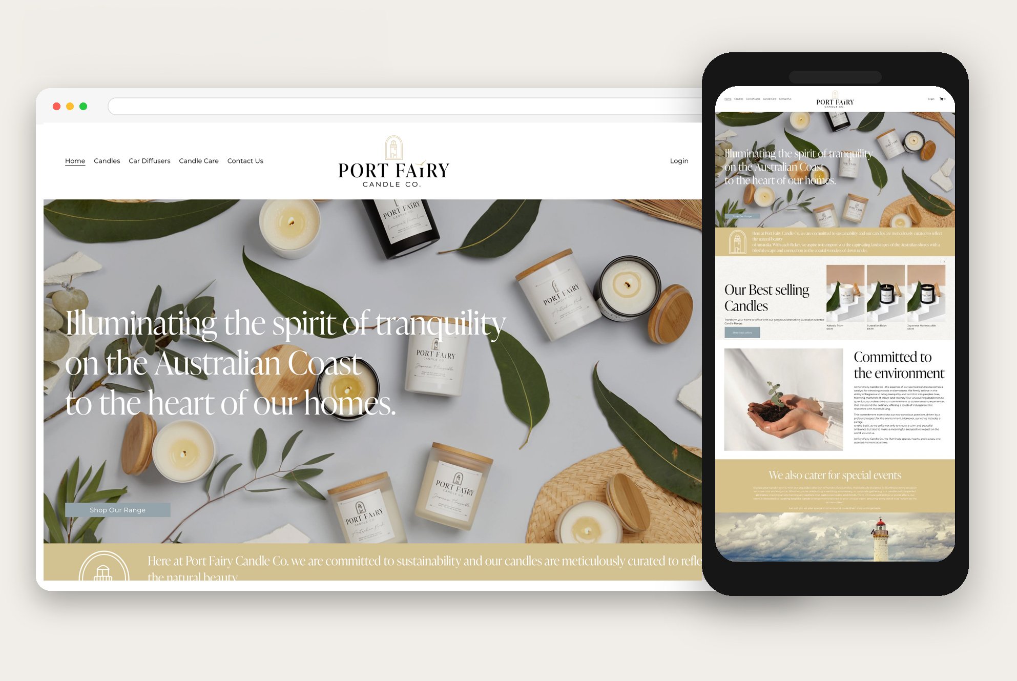
Brand Identity, Packaging, Collateral & Socials
Date:
16/08/24
Type:
Candle Business
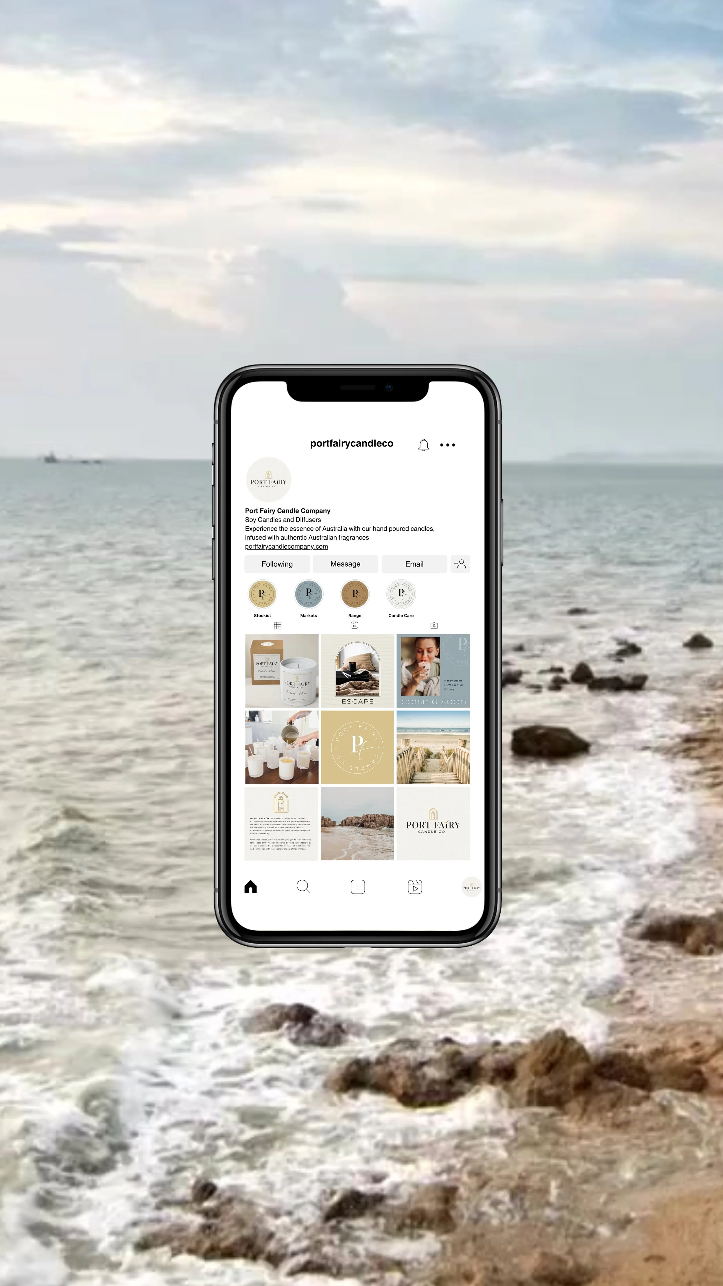
Port Fairy discovered us through Instagram after purchasing an existing business and needing support to refresh the brand for its next chapter.
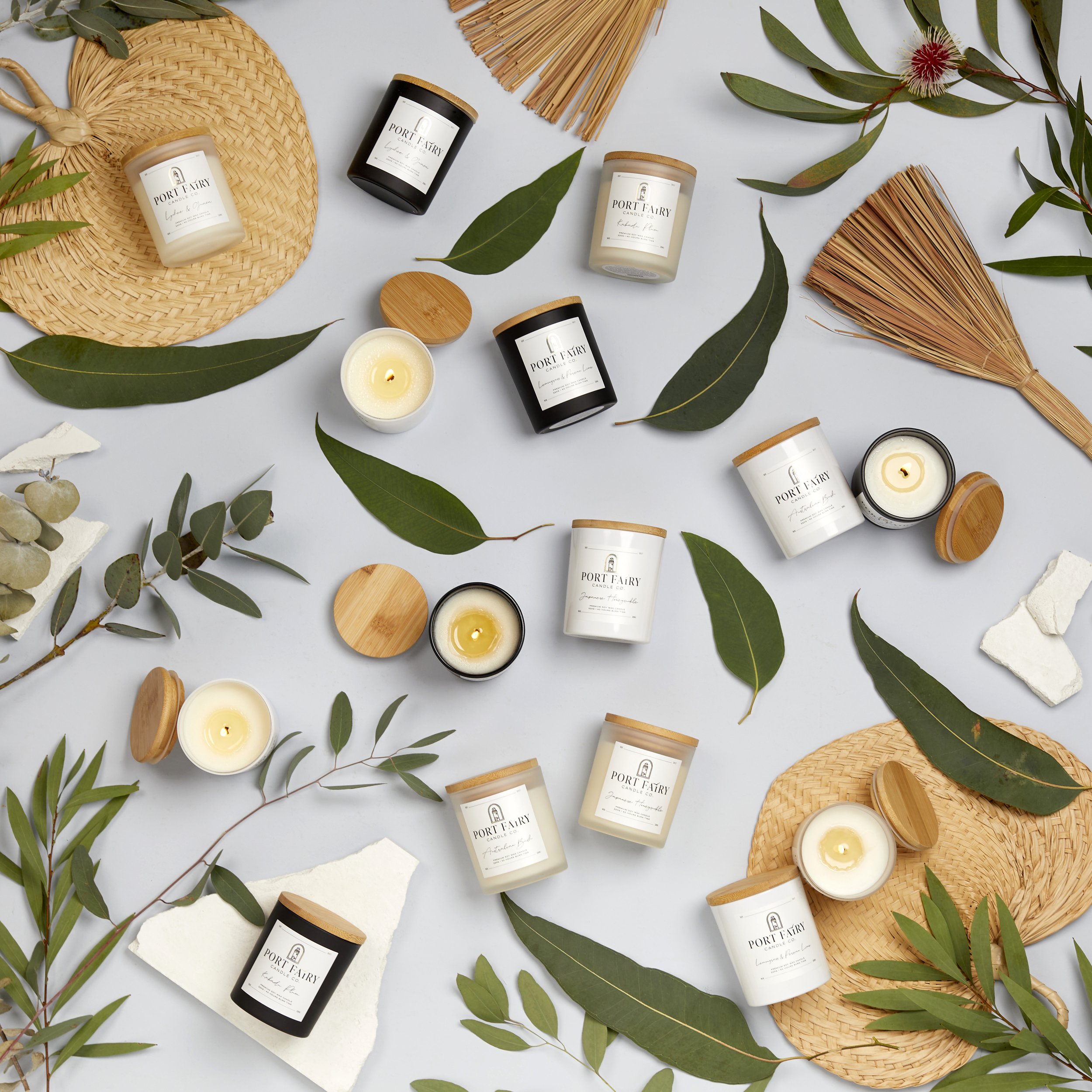
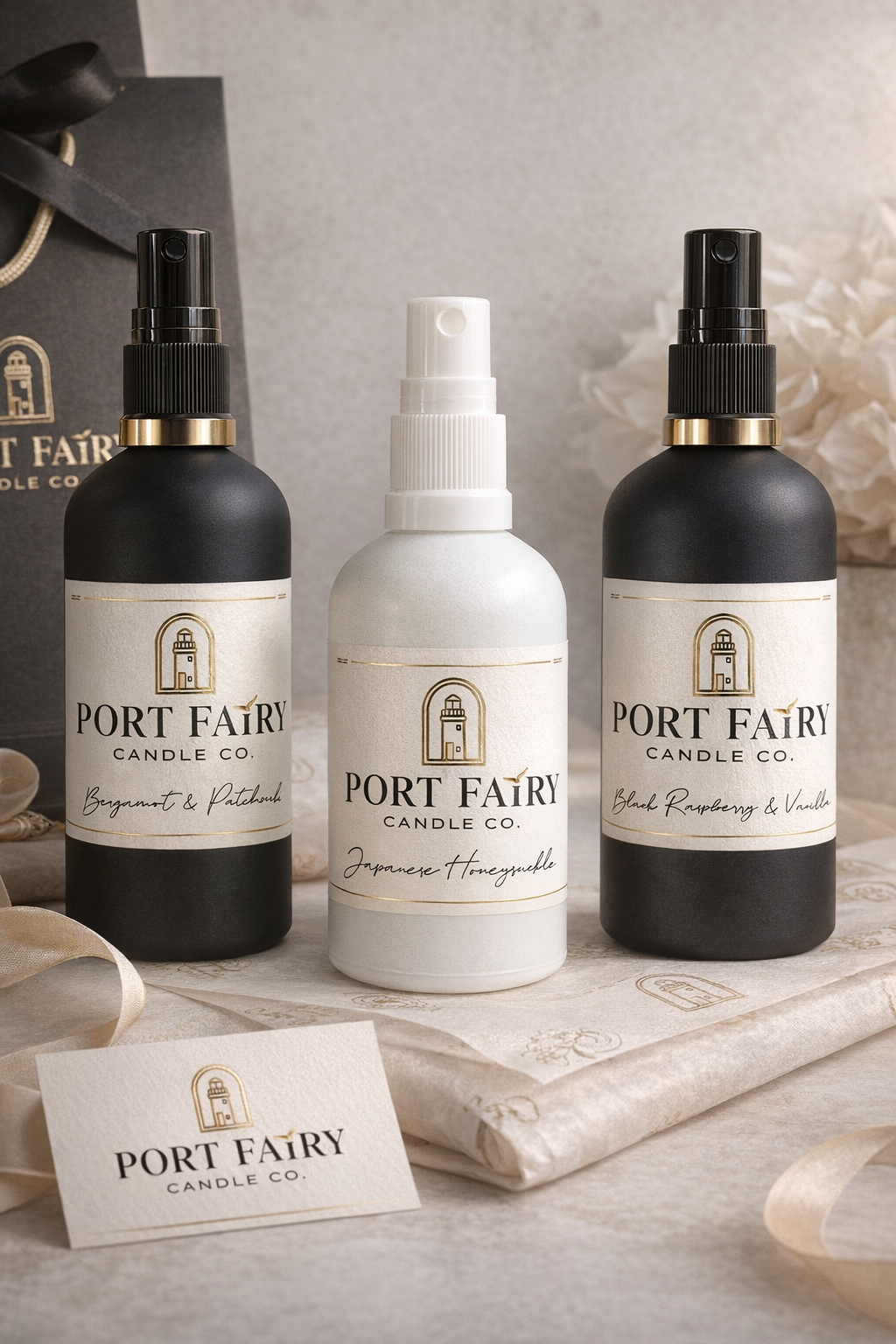
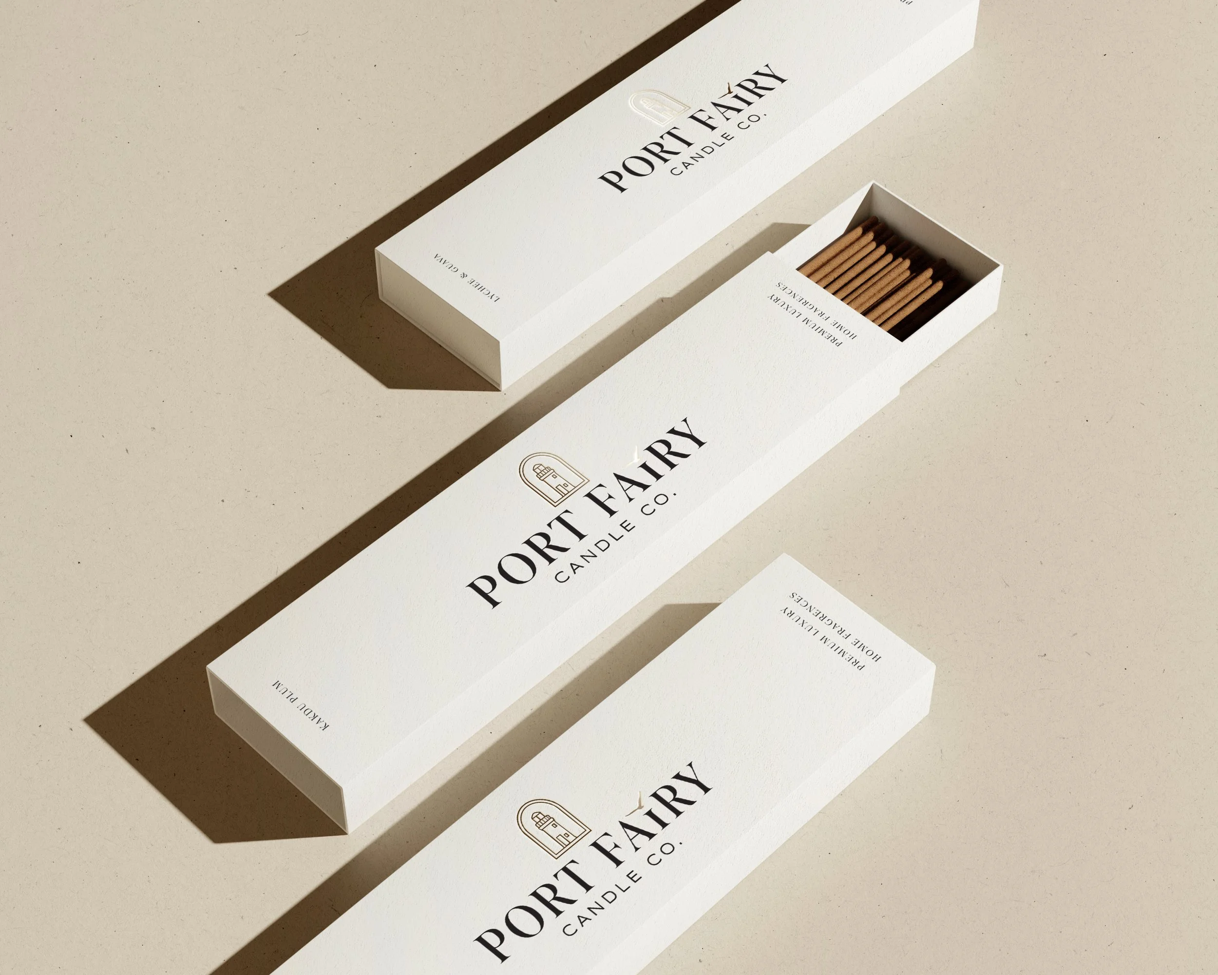
They wanted a premium rebrand that still honoured the iconic lighthouse, with luxury packaging and labels that felt modern, competitive, and impossible to miss on the shelf.
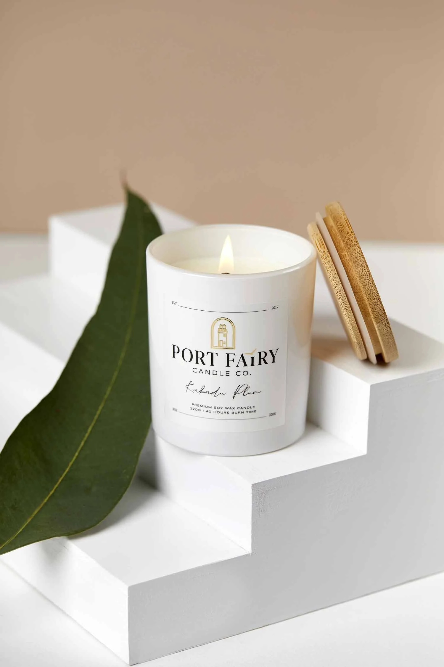
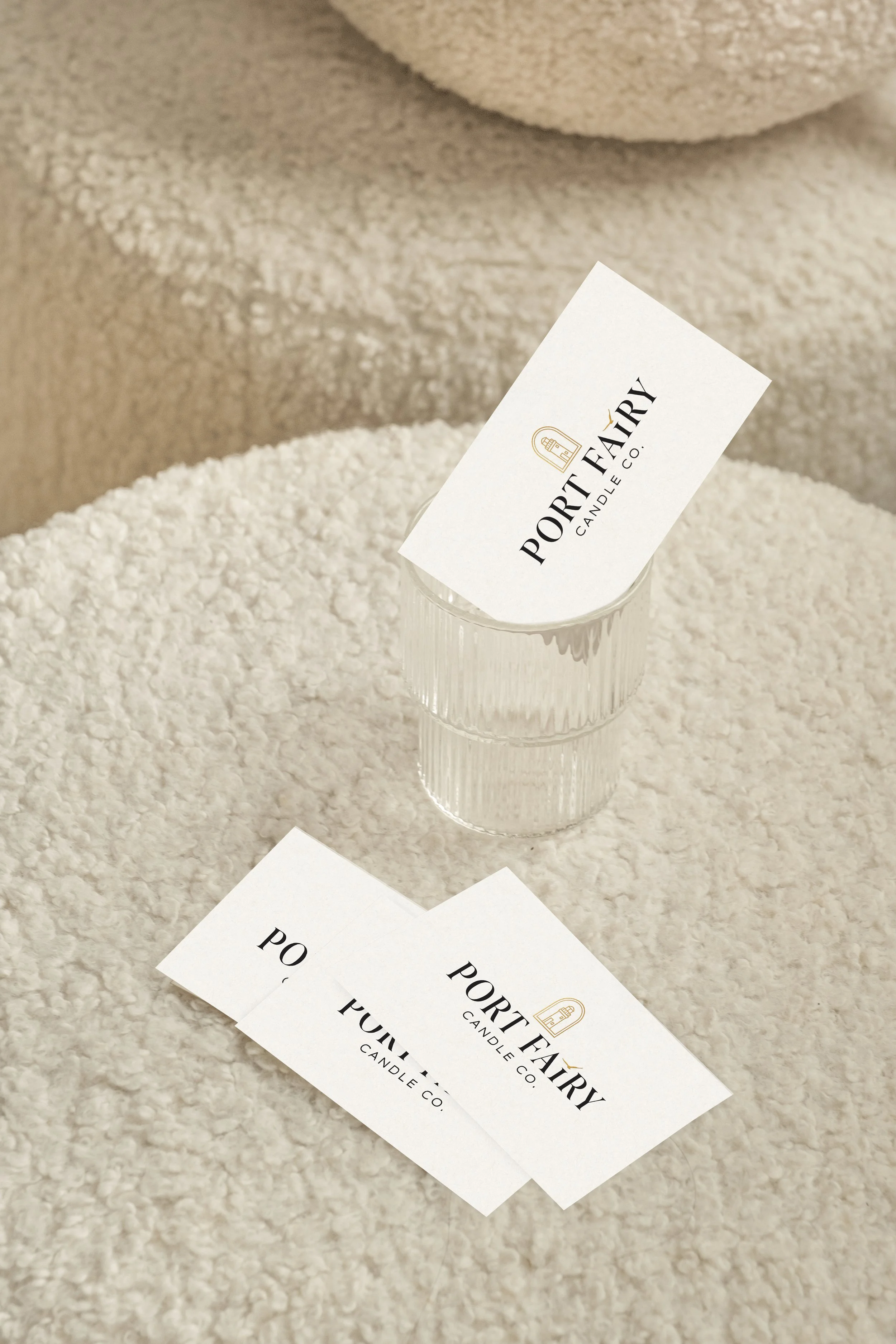
We designed a refined identity using classic serif typography for the name, paired with a soft script accent to bring warmth and elegance. The lighthouse was re-illustrated in clean, minimal linework, and a subtle seagull detail was integrated into the word “Fairy,” cleverly replacing the “i” for a distinctive, custom touch.
To elevate the finish, we introduced gold foil detailing on the lighthouse mark and seagull, and selected a textured label stock to add a tactile, high-end feel.
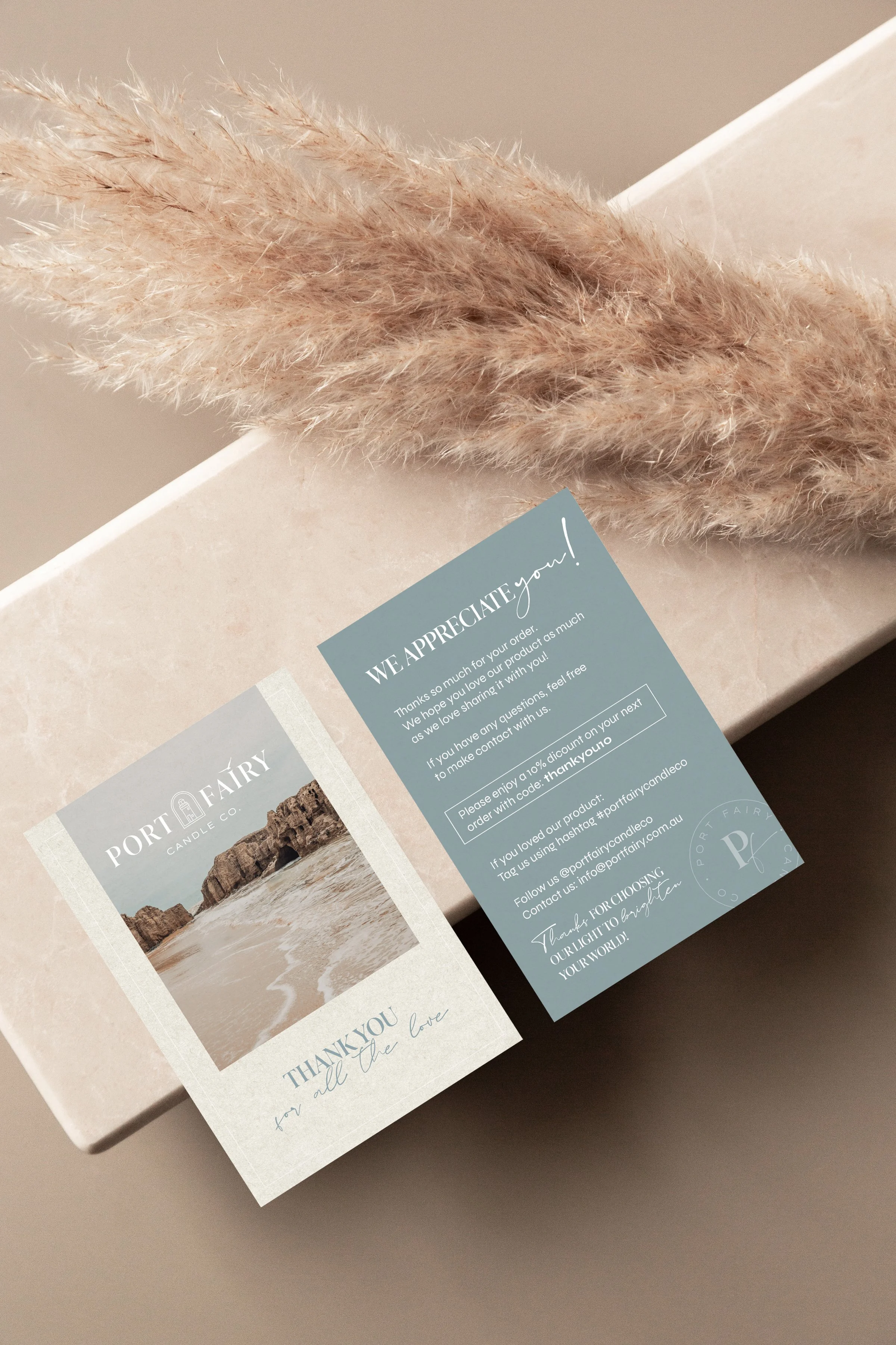
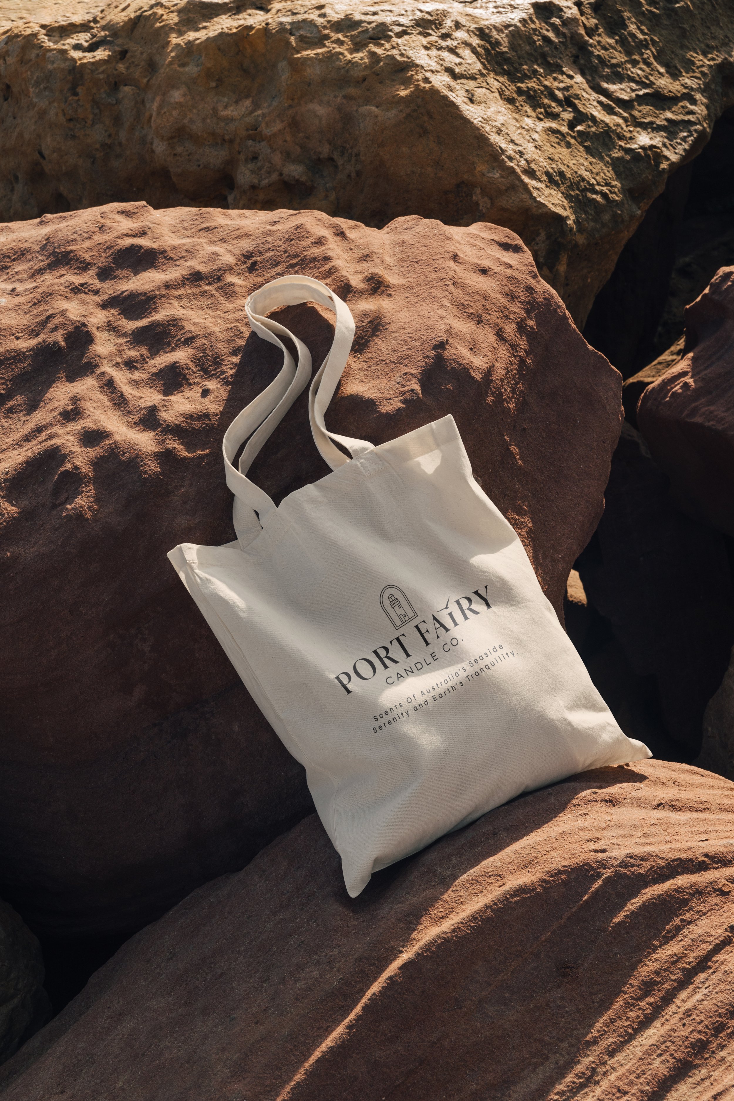
The brand was then rolled out across every touchpoint: tissue paper, ribbons, bags, thank you cards, business cards, and their website, bringing the full Port Fairy experience to life.