The Rocks: Sydney Through a European Lens
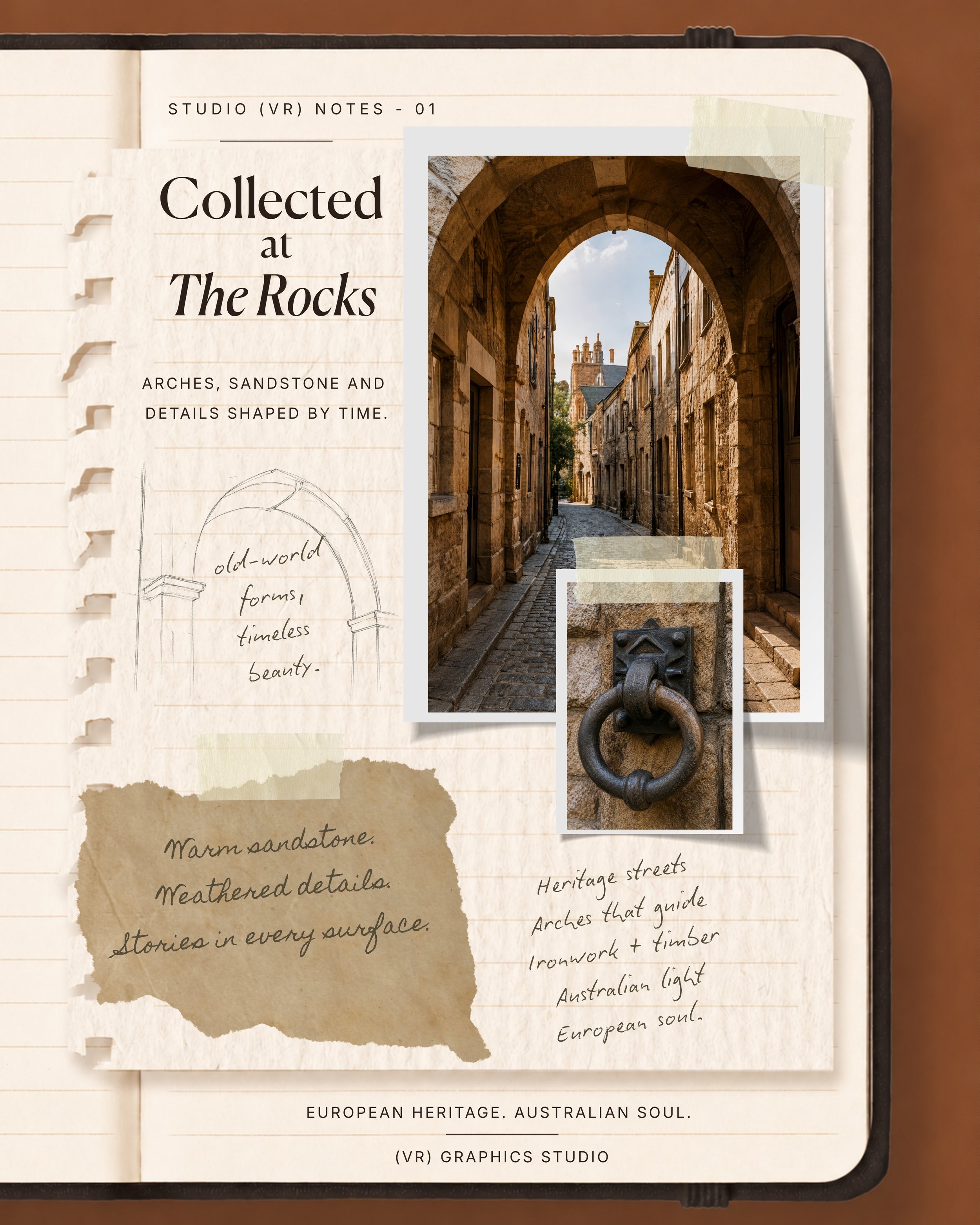
Some places stay with you long after you leave.
For me, The Rocks is one of those places.
There is something about the sandstone, the narrow laneways, the old ironwork and the way the afternoon light moves across the buildings. It feels unmistakably Sydney, yet there are moments when it could almost be somewhere in Europe.
That contrast became the starting point for The Notes.
I wanted to create something that captured the feeling of walking through the area slowly and noticing the details that are often missed, the texture of aged stone, worn timber, patterned tiles, cobbled pathways, heritage architecture and glimpses of the harbour beyond.
Rather than treating the location as a traditional Sydney travel story, I approached it through the STUDIO (VR) lens: as a study in atmosphere, material and visual identity.
Where Sydney Meets Europe
The Rocks has a character that feels layered rather than polished.
Its beauty comes from history, imperfection and contrast. Old sandstone sits beside contemporary architecture. Shadowed laneways open suddenly to bright harbour light. Rustic details are framed by one of the most recognisable cities in the world.
It reminded me of the European places I have always been drawn to, historic streets, handcrafted surfaces, old-world buildings and the quiet details that give a place its soul.
The result was an edit that felt both local and far away.
Sydney, seen through a European lens.
A Study in Texture
Texture became one of the most important elements of the story.
Sandstone walls, timber doors, ironwork, worn steps and cobblestones created a natural palette of warm cream, muted brown, soft grey and sun-faded gold.
These materials became more than background details. They formed the visual language of the edit.
It is the same way I approach branding. A strong identity is not created through a logo alone. It comes to life through colour, texture, typography, imagery and the smaller details that build a recognisable feeling.
The Rocks offered all of that naturally.
Building the Visual Story
I created the notes as a collection of journal-style pages, combining photography, sketches, materials and small observations from the day.
The layouts were intentionally layered and tactile, almost like the pages of a travel journal or an old design scrapbook.
Some pages focused on architectural details. Others explored the connection between heritage stone and harbour light. Rough pencil sketches brought a handmade element into the story, while cream paper and soft neutral tones kept the overall direction calm and refined.
The aim was not simply to document the location.
It was to interpret how the place felt.
The Details That Inspire a Brand
Creative inspiration rarely arrives as one complete idea.
More often, it begins with a colour, a shadow, an old doorway, a fabric, a building or a place that creates
a certain feeling.
The Rocks became a reminder that visual direction can begin anywhere.
It can start with the texture of sandstone.
The curve of an arch.
Sunlight reflecting across water.
A worn path that has carried people through the same place for generations.
These details may seem small, but together they create atmosphere—and atmosphere is often where the strongest brand stories begin.
A New Chapter for STUDIO (VR)
The Rocks Edit also represents the direction of STUDIO (VR).
It is a space where design extends beyond the finished project and into the references, places, stories and objects that shape the creative process.
Through The Edit, I want to share more of what inspires the studio, not only branding and graphic design, but architecture, fashion, travel, craftsmanship and the visual details that influence how I see the world.
The Rocks felt like the perfect place to begin.
Familiar, historic, textured and quietly European.
A piece of Sydney that feels like somewhere else.
Explore The Rocks Journal
See the complete visual story, including the photography, sketches, textures and details collected at The Rocks.
Until the next note,
Vanessa
STUDIO (VR)